The Challenge.
To design a mobile app that successfully connects with mentally ill people with low levels of motivation to establish healthy routines.
The Process.
Previous methods of mental prevention were determined on the basis of a competition analysis. Questioning those affected and their relatives revealed information about problems and needs. From this, three different user personas were developed, which differed greatly in age, diagnosis and living conditions in order to achieve a comprehensive solution. With the help of a journey user map, pain points were determined before work on the information architecture began. Task flows were derived from fictitious quotes from the user personas and finally a sitemap was developed. This was the basis for the first lo-fi wireframes from which the first prototype was created. After evaluating the user tests, the first round of iterations began. The process was repeated with a hi-fi prototype. A well-prepared usability test with test plan and script ensured good comparability. Changes were prioritized using a rainbow spreadsheet. After the basic structure was in place, the visual guidelines were set by defining the design language and style guide.
> Discovery
• asked potential users how they use existing products
• conducted a survey to learn more about user needs
> Concepting
• drew rough wireframes on paper to get a first idea of how features should work.
> Prototyping
• used the Marvel app to create a clickable, interactive prototype
> User Testing
• completed a task analysis through storyboarding three main feature in my MVP.
• reviewed user data to decide if a function was manageable and successful.
The Goal.
A mental health app that binds users to mobilize their willingness to change and make them resilient in the long term.
Role
UX/UI Designer
Primary Stakeholder
CareerFoundry UX Immersion Course
Project Scale
19 weeks
Tools Used
Pen & Paper / Photoshop / InDesign / Optimal Workshop / Usability Hub / Google docs / Marvel / Zoom / Illustrator / Slack / Figma
The number of people struggling with mental health problems is increasing every year, and while issues such as burnout and depression are no longer taboo subjects in today’s society, there is a severe lack of therapy and therapists. In this context, the Well. app offers prevention and follow-up care for people who suffer from symptoms regarding these Problems.
Problem Statement
What do we want to achieve?
Stressed people who want to change their situation need a way to put their resolution into action and integrate healthy routines into their everyday life through personalized journaling and uplifting suggestions because refocusing makes them more resilient and leads to a more balanced lifestyle. We‘ll know this to be true when we see how many people open and interact with the app multiple times a day and become loyal users.
Competitive Analysis
What good and bad approaches already exist?
I took a closer look at two of several wellness apps - Stoic. and mindshine.
They not only have a different approach visually, but also differ significantly in terms of content despite the same topic. While mindshine offers daily mental health coaching in a variety of small sessions that combine breathing exercises, uplifting thought-provoking impulses and physical exercises, Stoic.‘s approach is less about self-optimization but more about rethinking and the ability to
re-evaluate challenging situations.
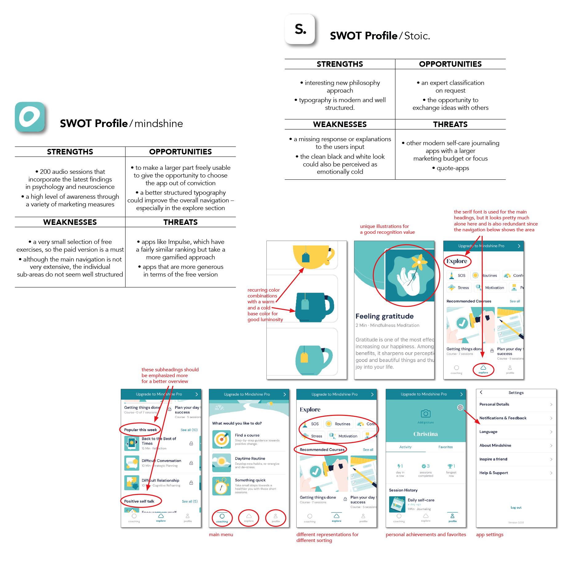
Key findings:
• avoidance of large, unstructured offers
• the possibility of individualization
• implementation as a voluntary offer without a paywall
Interviews
Asking the user
By focusing on the user perspective and formulating user stories, useful questions emerged for the subsequent interviews. My catalog of questions was about motivation, the need for security in relation to personal data and questions concerning therapeutic offers.
I had the opportunity to conduct a zoom interview with three people in my target group, i.e. people who are either struggling with mental health problems or who could provide information for professional reasons.
Key findings:
• user needs and preferences are very individual, so there must be a variety of treatment options
• sharing sensitive data is not a problem as long as it is explained what it is needed for
• the offer of therapist sessions meets with great approval, however, the first session must be free to get to know the service
• considering the mental state of the users, the app should be well structured, manageable and to some extent customizable
Affinity Mapping
Sorting results
I had expected some of the answers, some brought new insights – for example that data exchange is not fundamentally viewed negatively, but that acceptance goes hand in hand with the transparency of communication. All results were evaluated and sorted by topic.
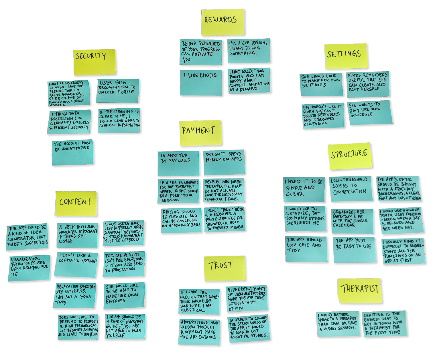
Interview Insights:
CONTENT
The research made it clear once again that there must be a variety of measures to enable individual use.
STRUCTURE
The structure must be clear and easy to handle in order to avoid additional stress.
SETTINGS
The app must also be editable in order to adapt to the wishes of the user and to give those affected an additional feeling of self-control.
THERAPIST
The integration of a therapist offer is welcomed uniformly. However, the form of contact should be individually designable.
TRUST
Trust can be built through unbiased scientific evidence.
Ads are inappropriate and would make the user feel that their issue should be monetized.
SECURITY
As long as the data exchange is made transparent and explained, it is accepted.
REWARDS
What motivates users, like everything else, varies widely, but the unifying element is the will to feel better.
PAYMENT
If the app is perceived as a serious offer, users are willing to pay for the offer but would like to test the service for free.
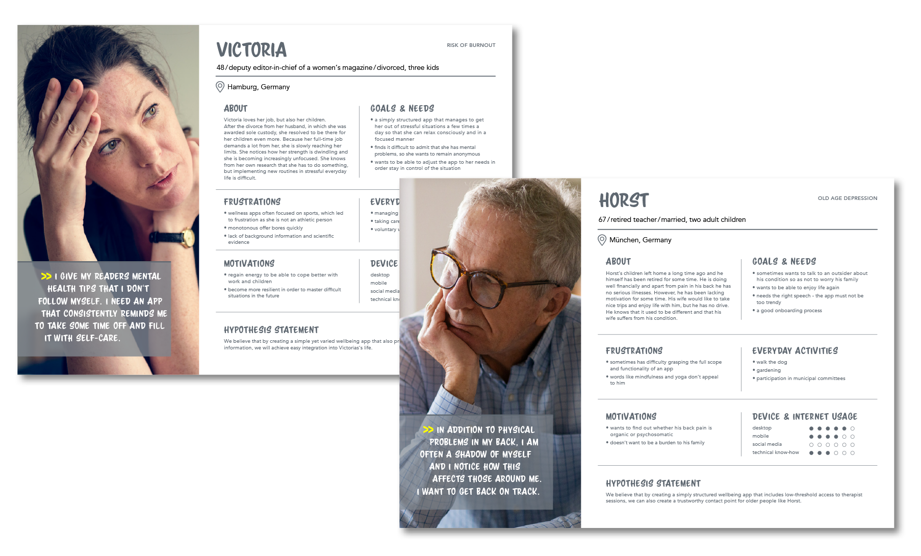
User Personas
Using the results obtained
With all the insights from user responses, creating personas was easy. I made three to achieve a great variety. Giving the research a human face and a narrative makes it possible to illuminate the different points of view and needs and to argue from the personas‘s perspective.
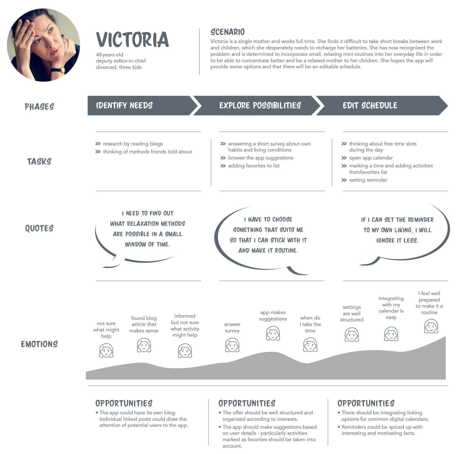
User Journey Map
Let’s get emotional
User-centric design means identifying and eliminating potential pain points. I managed to do this by going through the customer journey from the perspective of my personas. This promotes an empathetic approach, which is crucial for a user-friendly implementation.
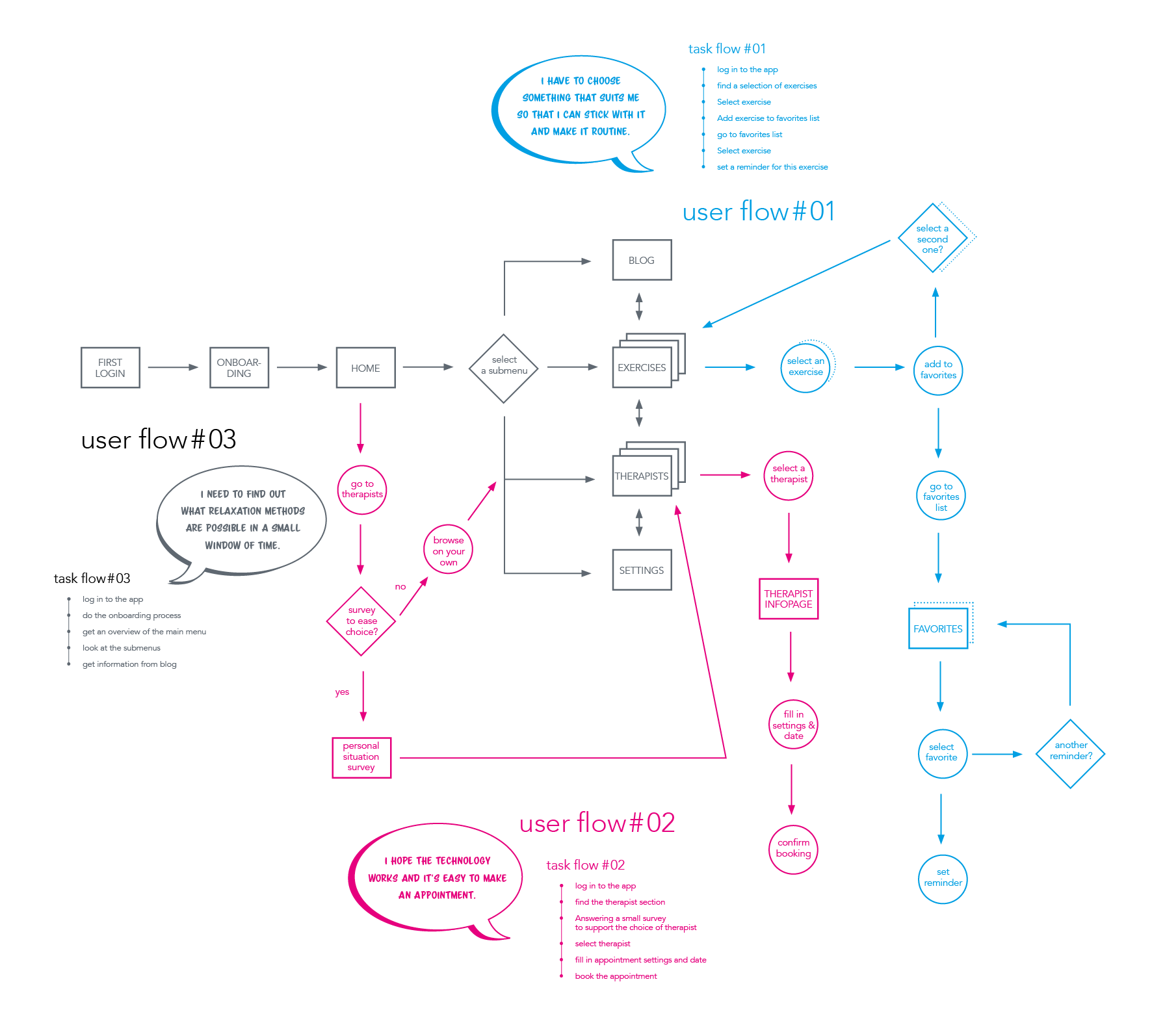
User Flows
How to get there
With the help of user tasks I created user flows. They provide information about the necessary scope of the application and can help to create a meaningful navigation structure.
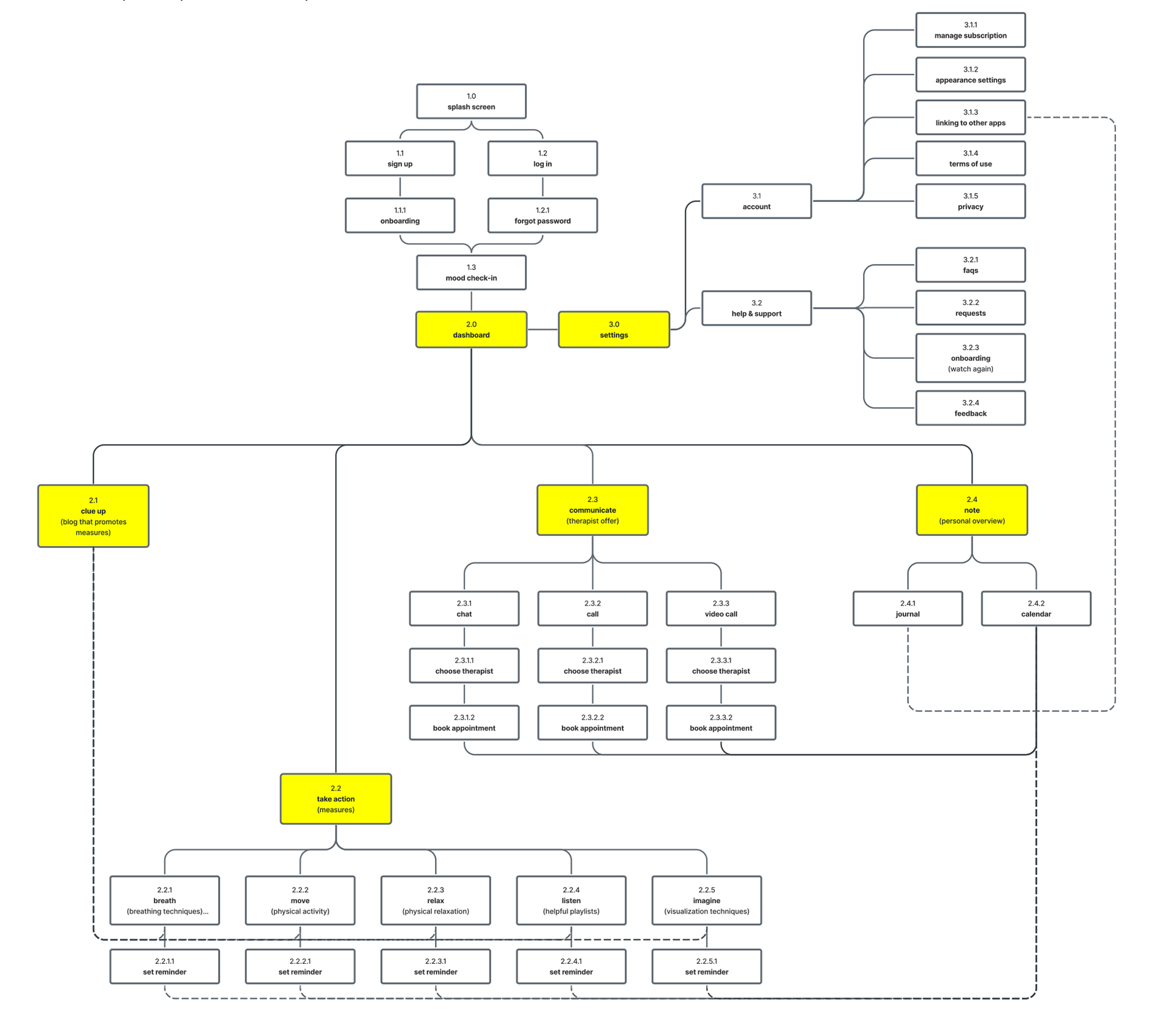
Sitemap
Building a structure
By developing the user‘s tasks and flows, it is possible to define the scope and content of the subpages. Having created a preliminary structure, I tested the intuitiveness of my approach using a digital card sorting survey. Only small adjustments were necessary. Overall, the participants came up with very similar sorting solutions.
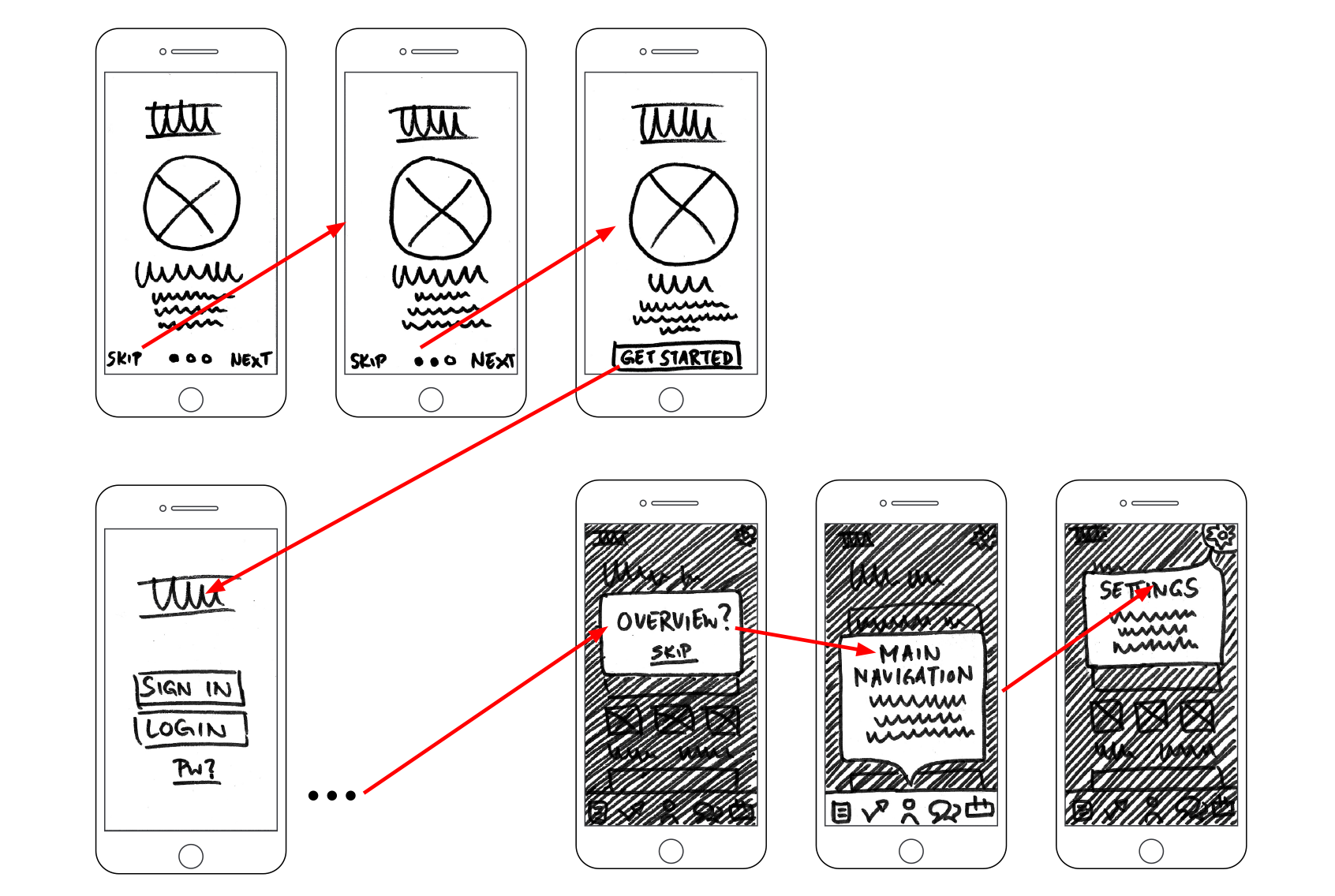
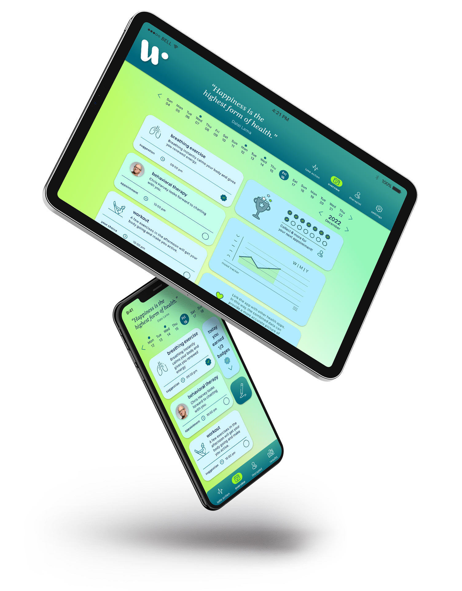
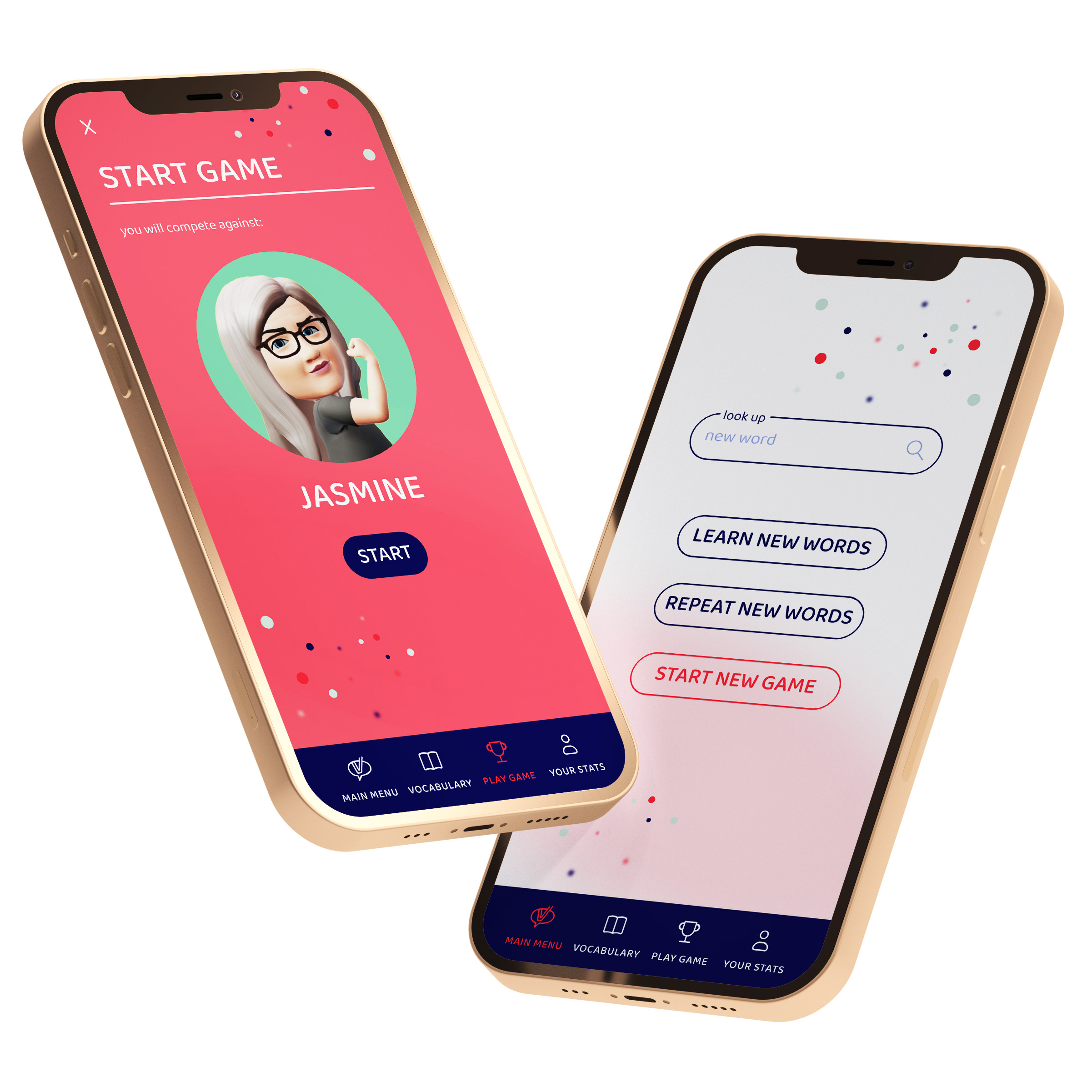
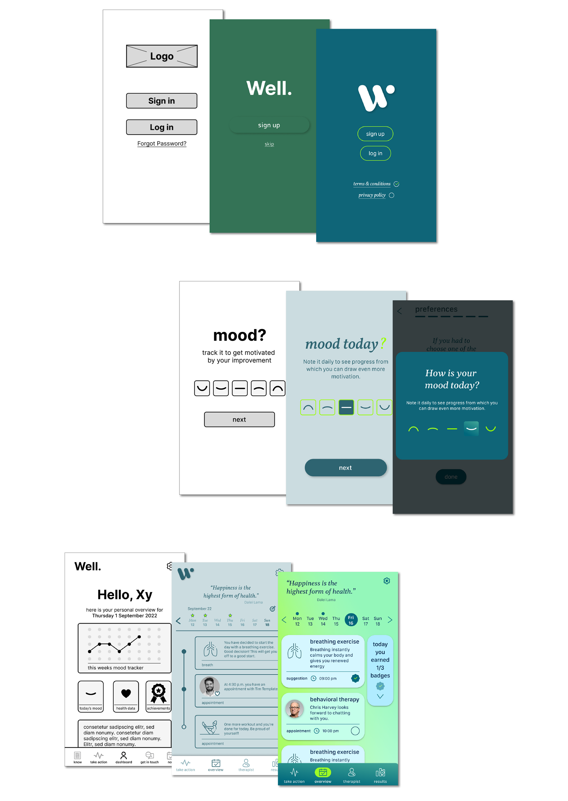
Low-Fidelity Prototype
First drafts
The first rough sketches were about working out a functional and easy-to-understand navigation. From my point of view, including established solutions is playing an important role. Continuity and the opportunity to apply what has already been learned gives the user confidence and helps to concentrate on the content.
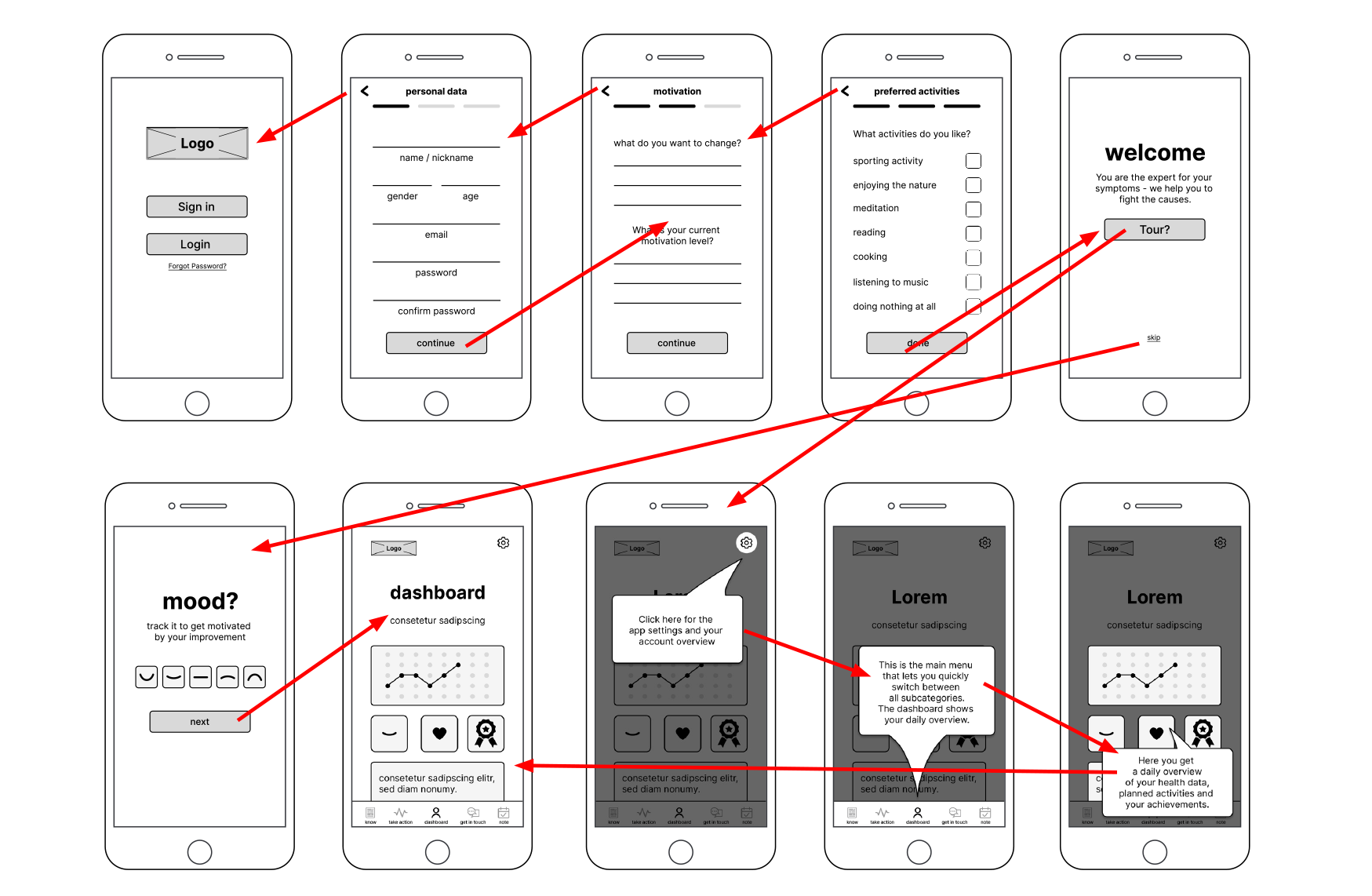
high-fidelity prototype
Moving on digitally
The draft on paper makes quick changes easy, but once the basic concept is in place, it makes sense to continue working on the screen. On the one hand, copying the main elements is simplified and, on the other hand, you get a good feeling for screen size and proportion.
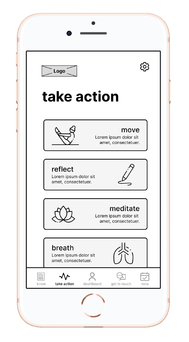
Interactive Prototype
Bringing the design to life
In order to check the functionality with the help of user tests, an interactive prototype was built.
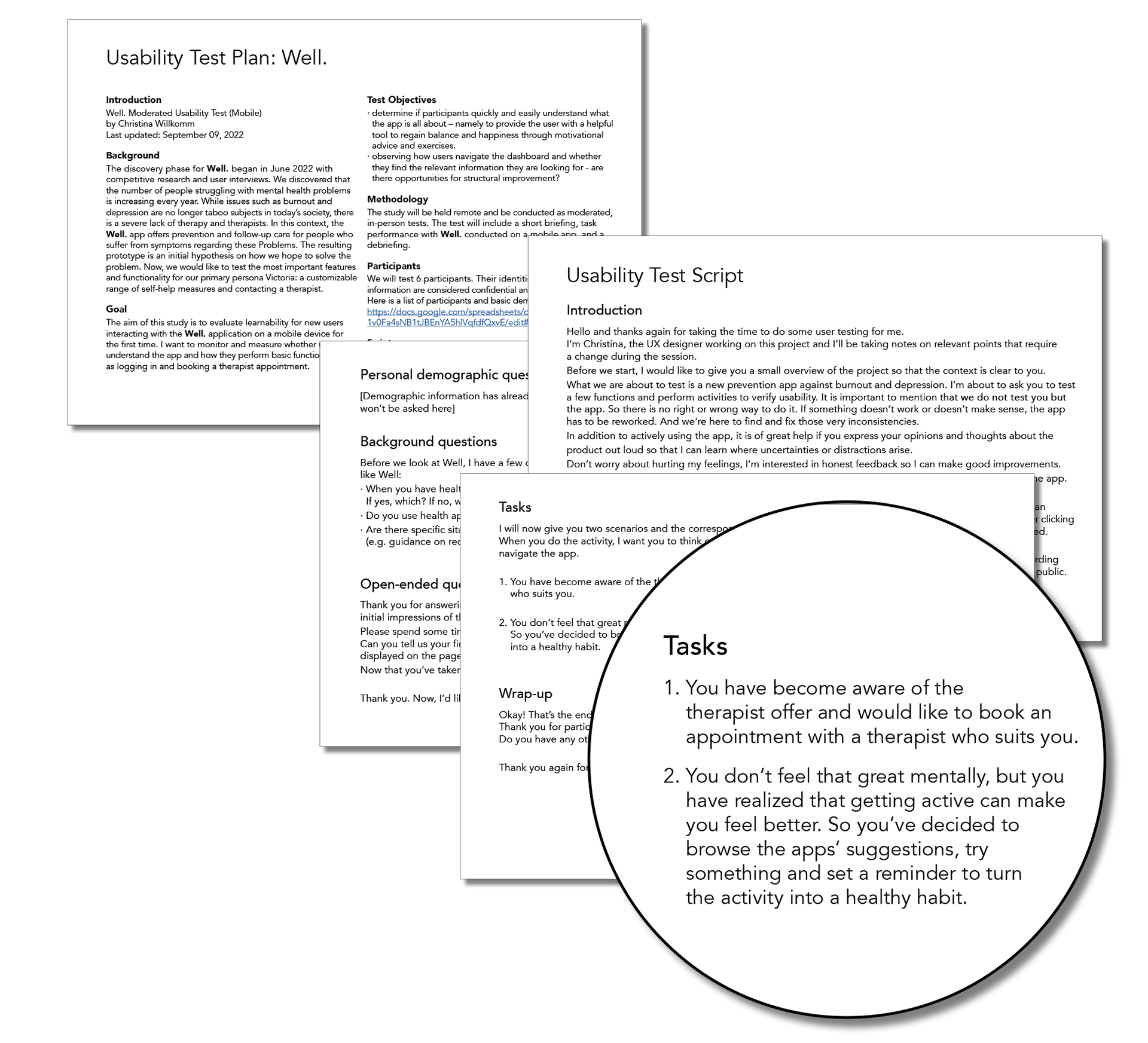
Test Plan & Script
Let the tests begin!
The aim of this test was to evaluate learnability for new users interacting with Well. on a mobile device for the first time. I wanted to monitor and measure whether users understand the app and how they perform basic functions such as logging in and booking a therapist appointment. Except for kids, who need to be addressed differently, Well. does not exclude any target group, since psychological problems can occur at any age and in any phase of life. I recruited users through my personal network. To avoid sample bias, I ensured the selection process was accurate by including users with age, gender, ethnic and social differences. I conducted the test with six participants either in person or via Zoom. The tests lasted between 15 and 20 minutes.
Learnings
Basically, the tests went well, but I still have to learn to tolerate silence and not give too many hints to quickly. You get into a dialogue about changes, but you have to be careful not to influence the participant.
On the technical side, next time I would try to make the test situation even more natural by having the participants operate the app on their smartphone and not on the computer screen - i.e. act with their fingers and not with a trackpad or mouse.
Test Report
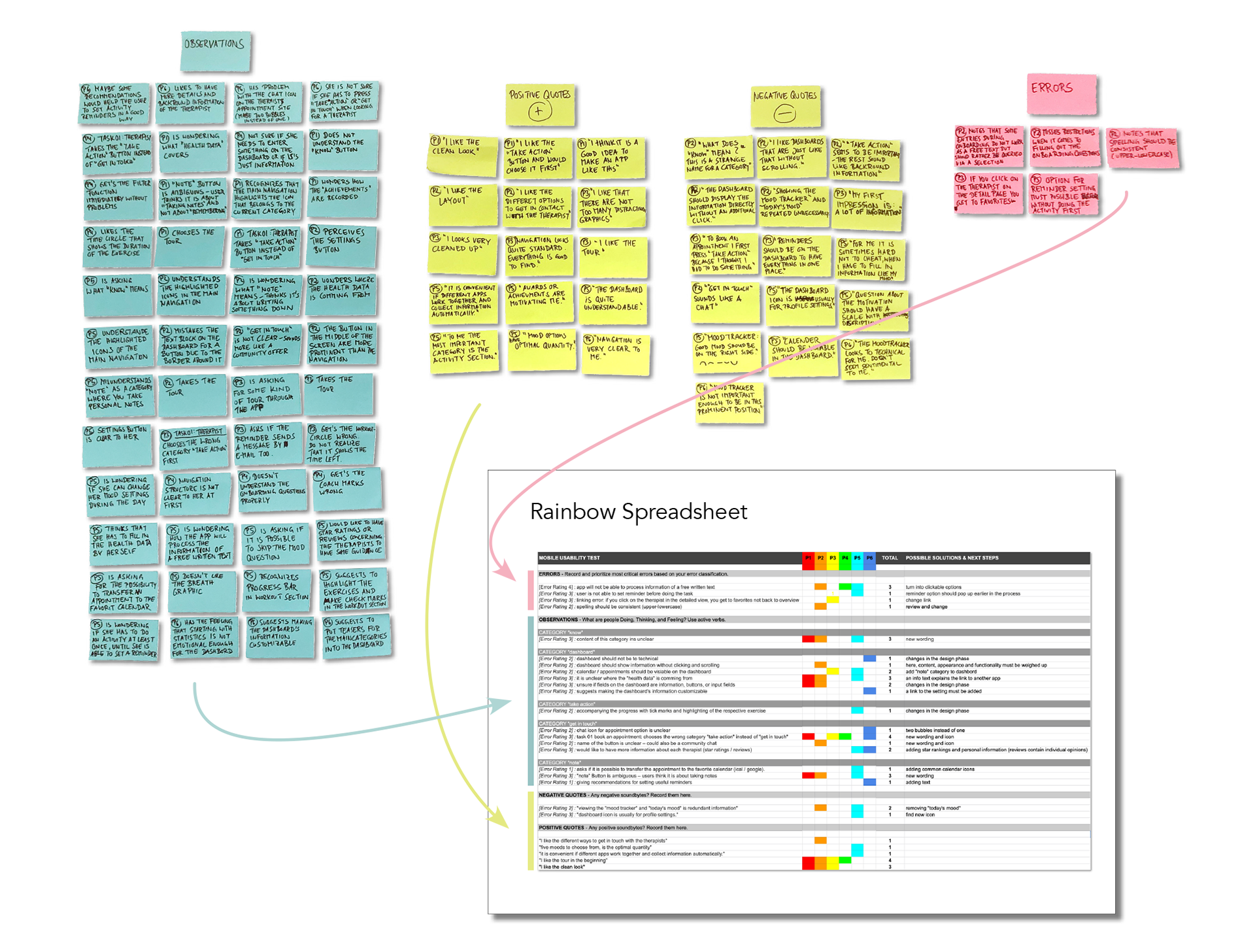
Harvesting the outcome
A total of six participants with different demographic backgrounds were interviewed, key observations and statements were sorted using affinity mapping and then prioritized using a rainbow spreadsheet.
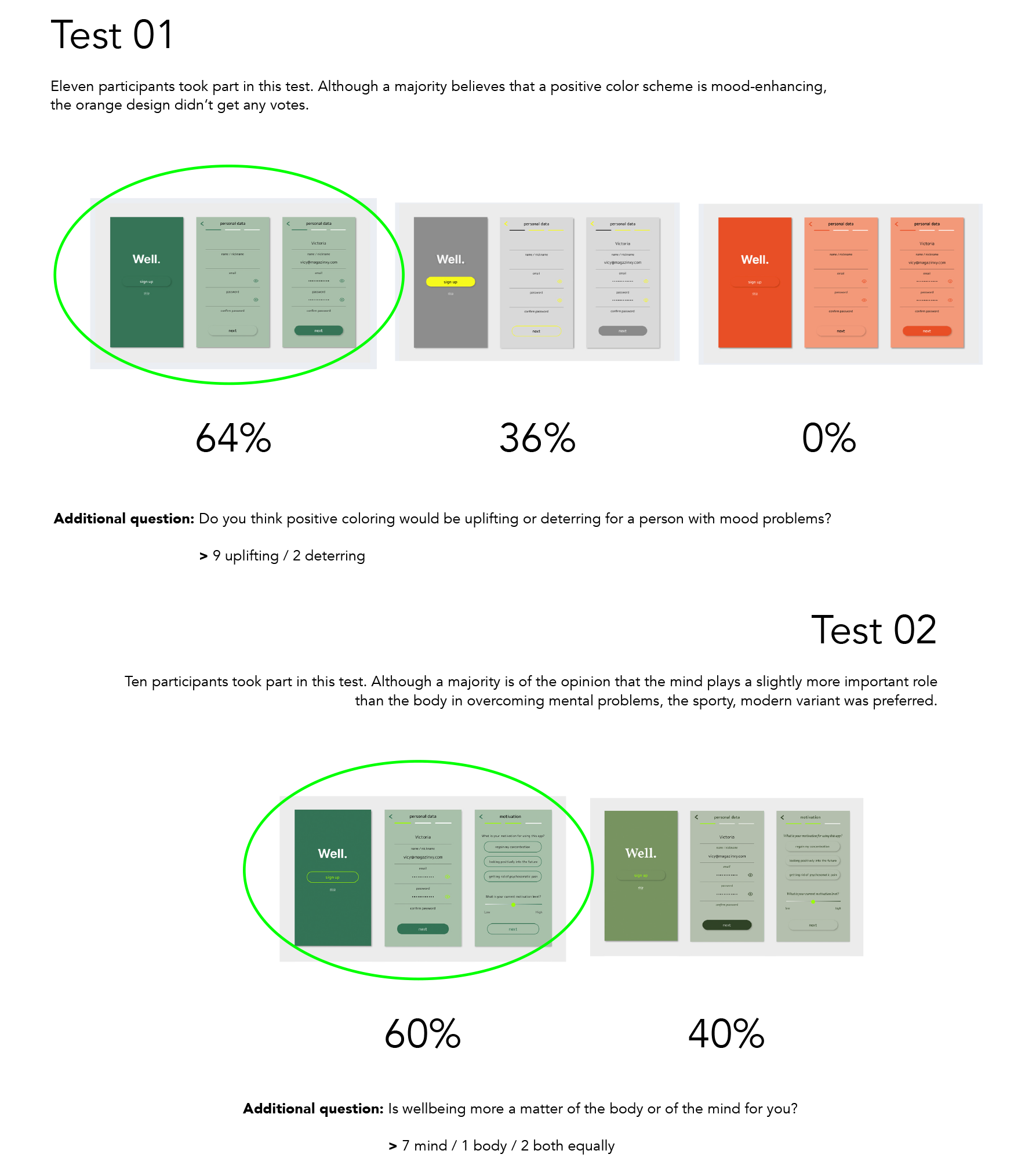
AB Tests
User decisions
There are clearly defined faults and there are sentiments that can be decided by the majority. AB tests are a good way to ask the user about their personal likings and to incorporate the result into the development.
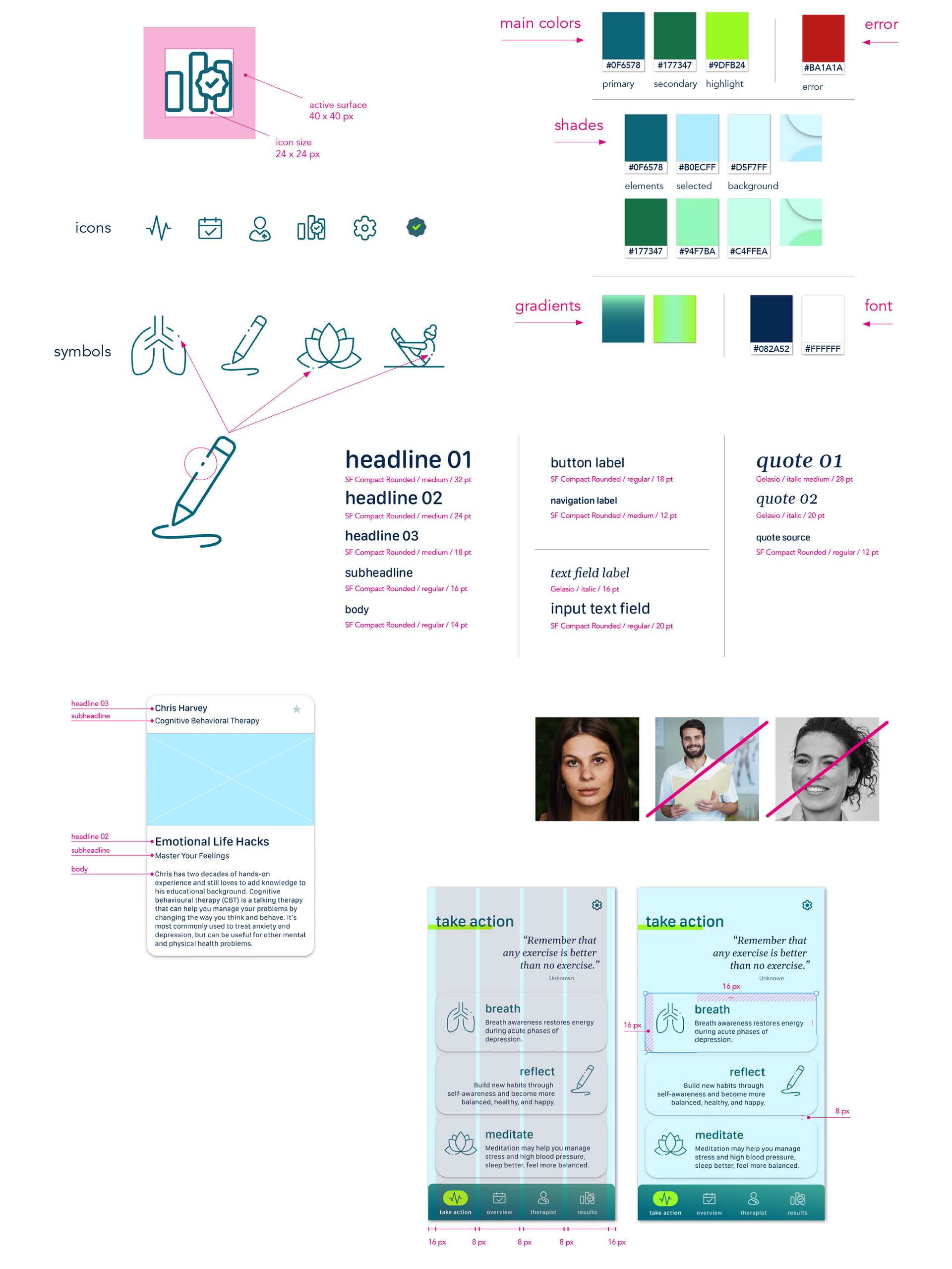
Style Guide & Design Language
Increasing the recognition value
After general rules have been incorporated into the design, specific optical product features still have to be defined in order to enable everyone involved to continue working on the app consistently.
Iteration States
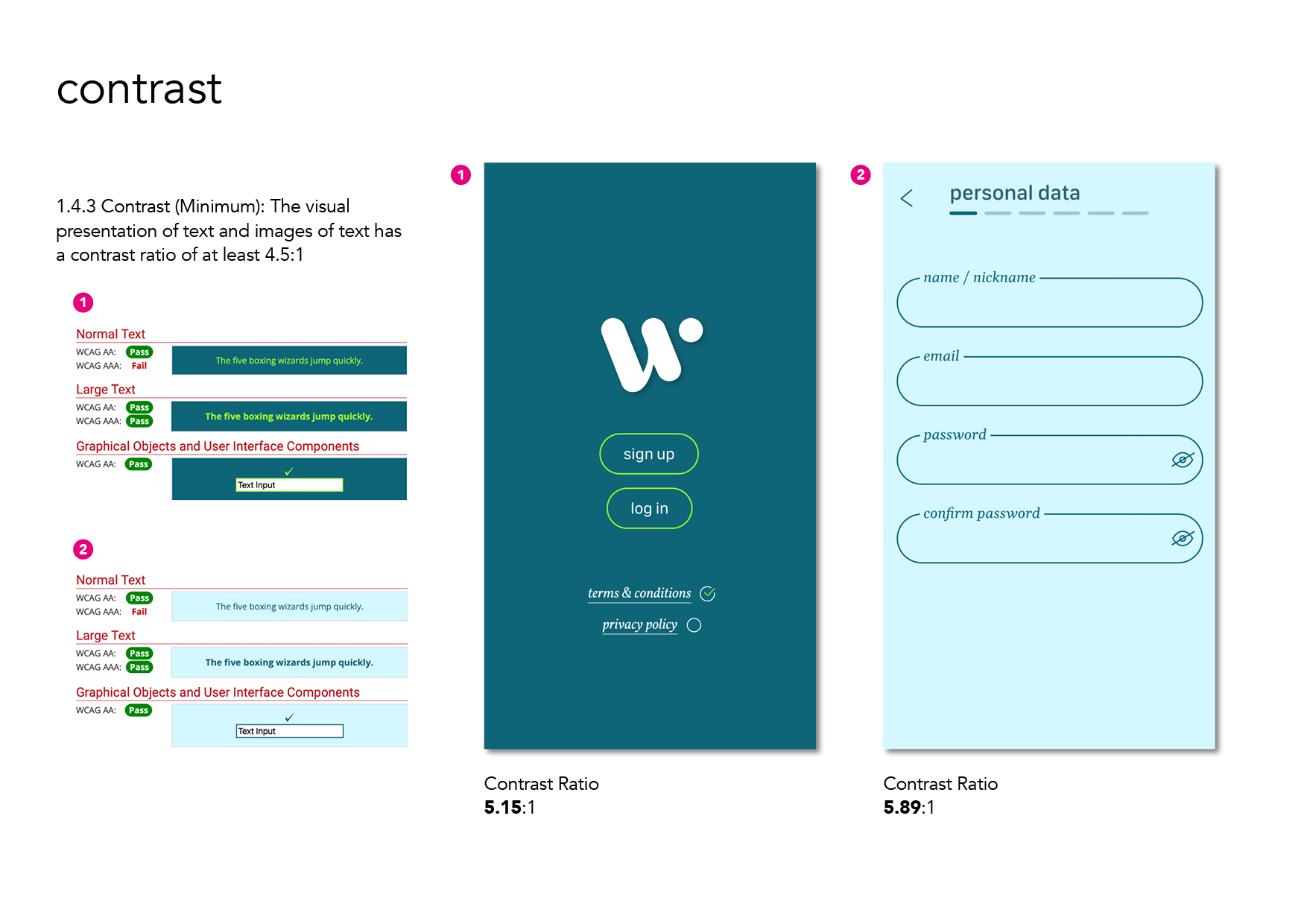
Constant change
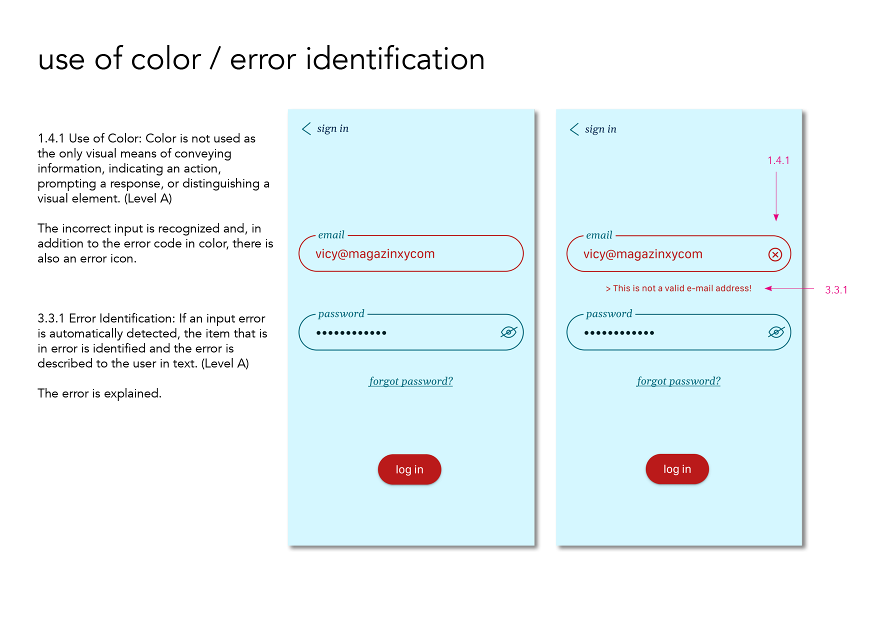
Through user interviews, the use of proven stylistic devices and the exchange with other UX designers, a well thought-out result is gradually created. However, new aspects are constantly being added, such as the topic of accessibility, which is becoming more and more important. So the current version of the app is always ready for new features and improvements...
Iterative Steps
The Conclusion.
This was my second UX project. I realized the importance of practicing impartiality. You have to remain open to the test results in order to be motivated to find convincing solutions. A second important point is the correct analysis of the results. Methods like affinity mapping or rainbow spreadsheets have proven to be powerful tools for me. Visualizing results helps to avoid "perceived" results.